
Bringing the Outside In: Why I Used Exterior Stone Indoors
A material does not have to stay where we expect it
When I chose exterior stone for the inside of this home, I was looking beyond the usual rules about where a material belongs. I wanted the rooms to feel warm, grounded, and connected to nature. Stone offered something paint alone could not: depth, variation, and a texture that changes as light moves across it.
Taking a design risk does not mean choosing something unusual just to be different. It means recognizing when an unexpected material can make a space feel more like the home you want to live in. Here, bringing exterior stone indoors became one of the decisions that gave the home its character.
Why stone makes a home feel organic
An organic interior has a sense of ease. Natural-looking textures, earthy colors, and gentle variation keep a room from feeling too polished or predictable. The stone’s uneven surface and mix of cream, beige, and gray create that feeling in a way that a perfectly flat wall cannot.
I paired the stone with warm wood, soft furnishings, and curved architectural details. Those elements balance its visual weight and let the home feel inviting. Repeating the material in a few considered places also helps the rooms feel connected.
In the kitchen, a textured focal point
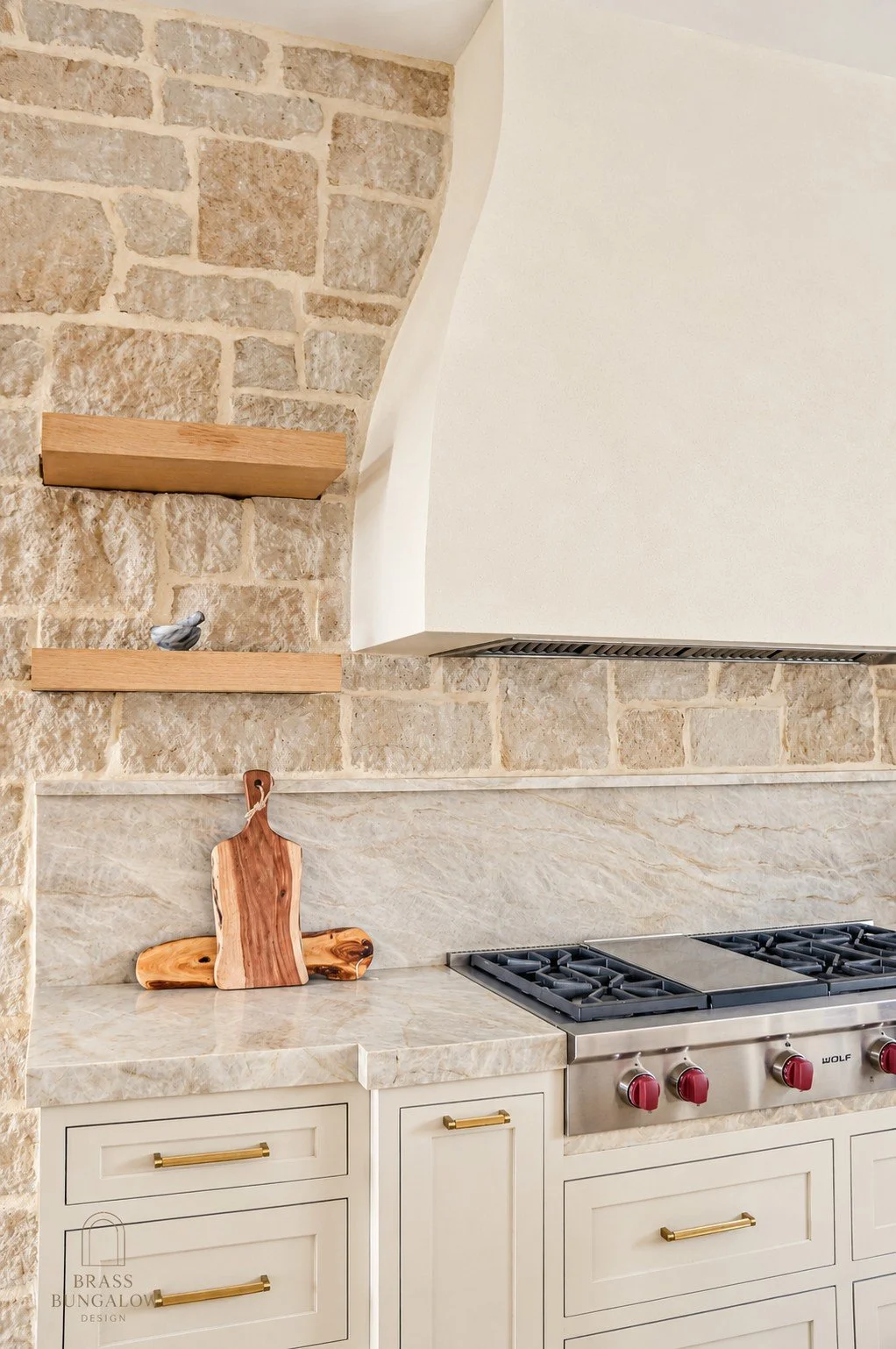
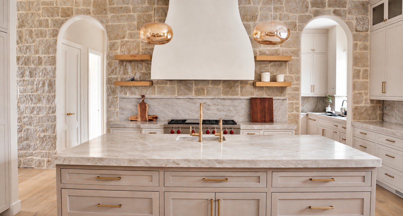
The kitchen has cabinetry, appliances, and other smooth surfaces that need to work together. I chose stone here to introduce warmth and contrast, and to give the room a focal point with more depth than a painted wall.
Beside the wood cabinetry and stone countertops, the textured wall becomes part of the room’s material palette. It draws the eye without relying on a bold color and makes the kitchen feel connected to the rest of the home.
Along the stairs, a connection between spaces
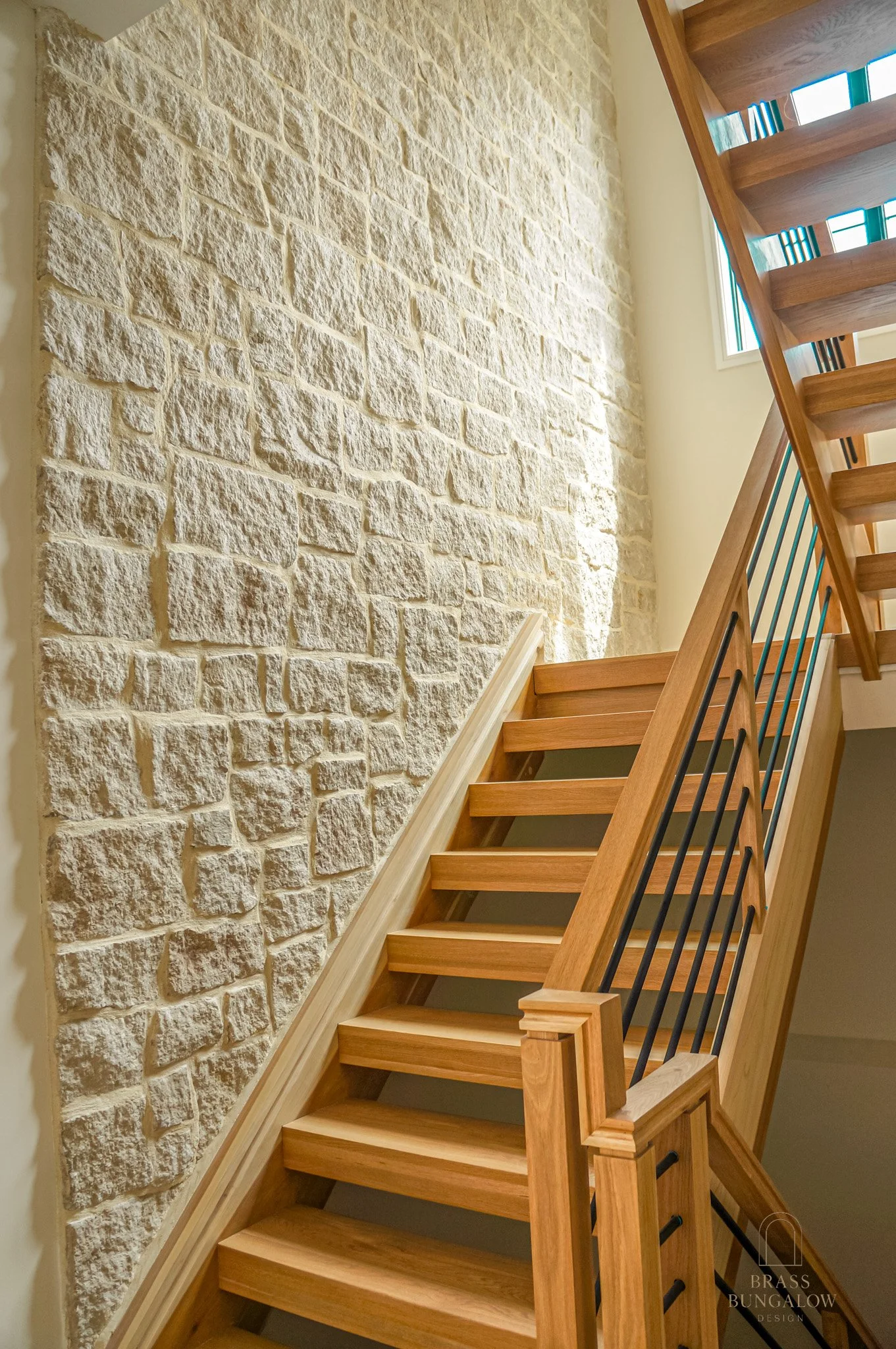
A staircase is more than a route from one floor to another. It is an architectural moment you see and move through every day. I chose stone along the stairs to make that transition feel intentional and to carry the home’s organic palette into a space that might otherwise be overlooked.
The textured wall contrasts with the wood treads and slim railing. It gives the staircase a grounded backdrop, while the lighter, open elements keep the composition from feeling heavy.
Grout color is part of the design
Choosing the stone is only part of the decision. The color between the pieces changes how you read the whole surface. With stone veneer, that joint material may be mortar rather than tile grout, but its color still plays an important visual role.
Stone often contains several shades. The joint color can make some of those tones feel more prominent and can soften or emphasize the outline of each piece.
- For a lighter overall impression: I would start by testing a light joint color that works with the stone’s palest tones. It can help the wall feel softer and more unified.
- To emphasize beige and warmth: Cream or a warm neutral can connect with the stone’s beige tones and give the composition a warmer feel.
- To emphasize gray tones: A grayish joint color can connect with cooler shades already present in the stone and make the overall palette feel cooler.
These are starting points, not guarantees. Contrast matters too. A light joint against dark stone may outline each piece quite strongly. The stone’s actual colors, joint width, finish, and the room’s lighting all affect the result.
Test the combination in your own light
Before deciding, I recommend a sample board using the actual stone and proposed joint colors. Look at the samples in the room during the day and under the lighting you will use at night. Let the joint material cure before judging it, and have your installer confirm the correct product and installation method for the stone and location.
A color chart is a useful starting point, but it cannot show exactly how the finished combination will look in your home. LATICRETE’s color guidance also notes that appearance depends on lighting, installation conditions, and the tile or stone used.
Make room for thoughtful risks
Some of the most personal rooms come from questioning what a material is supposed to be used for. Exterior stone indoors was a way to bring texture, warmth, and a sense of nature into this home. The result feels intentional because the stone, wood, lighting, and joint color were considered together.
If you are drawn to an unconventional idea, explore it. Start with samples, consider how it fits your home, and give the details the attention they deserve.
Explore the Prentice Paradise project or get in touch about your own space.
A material does not have to stay where we expect it
When I chose exterior stone for the inside of this home, I was looking beyond the usual rules about where a material belongs. I wanted the rooms to feel warm, grounded, and connected to nature. Stone offered something paint alone could not: depth, variation, and a texture that changes as light moves across it.
Taking a design risk does not mean choosing something unusual just to be different. It means recognizing when an unexpected material can make a space feel more like the home you want to live in. Here, bringing exterior stone indoors became one of the decisions that gave the home its character.
Why stone makes a home feel organic
An organic interior has a sense of ease. Natural-looking textures, earthy colors, and gentle variation keep a room from feeling too polished or predictable. The stone’s uneven surface and mix of cream, beige, and gray create that feeling in a way that a perfectly flat wall cannot.
I paired the stone with warm wood, soft furnishings, and curved architectural details. Those elements balance its visual weight and let the home feel inviting. Repeating the material in a few considered places also helps the rooms feel connected.
In the kitchen, a textured focal point
The kitchen has cabinetry, appliances, and other smooth surfaces that need to work together. I chose stone here to introduce warmth and contrast, and to give the room a focal point with more depth than a painted wall.
Beside the wood cabinetry and stone countertops, the textured wall becomes part of the room’s material palette. It draws the eye without relying on a bold color and makes the kitchen feel connected to the rest of the home.
Exterior stone brought indoors creates a textured focal point in the kitchen.
Warm wood cabinetry and the stone wall work together in the kitchen.
Along the stairs, a connection between spaces
A staircase is more than a route from one floor to another. It is an architectural moment you see and move through every day. I chose stone along the stairs to make that transition feel intentional and to carry the home’s organic palette into a space that might otherwise be overlooked.
The textured wall contrasts with the wood treads and slim railing. It gives the staircase a grounded backdrop, while the lighter, open elements keep the composition from feeling heavy.
Stone gives the wood staircase a warm, textured backdrop.
Grout color is part of the design
Choosing the stone is only part of the decision. The color between the pieces changes how you read the whole surface. With stone veneer, that joint material may be mortar rather than tile grout, but its color still plays an important visual role.
Stone often contains several shades. The joint color can make some of those tones feel more prominent and can soften or emphasize the outline of each piece.
For a lighter overall impression: I would start by testing a light joint color that works with the stone’s palest tones. It can help the wall feel softer and more unified.
To emphasize beige and warmth: Cream or a warm neutral can connect with the stone’s beige tones and give the composition a warmer feel.
To emphasize gray tones: A grayish joint color can connect with cooler shades already present in the stone and make the overall palette feel cooler.
These are starting points, not guarantees. Contrast matters too. A light joint against dark stone may outline each piece quite strongly. The stone’s actual colors, joint width, finish, and the room’s lighting all affect the result.
Test the combination in your own light
Before deciding, I recommend a sample board using the actual stone and proposed joint colors. Look at the samples in the room during the day and under the lighting you will use at night. Let the joint material cure before judging it, and have your installer confirm the correct product and installation method for the stone and location.
A color chart is a useful starting point, but it cannot show exactly how the finished combination will look in your home. LATICRETE’s color guidance also notes that appearance depends on lighting, installation conditions, and the tile or stone used.
Make room for thoughtful risks
Some of the most personal rooms come from questioning what a material is supposed to be used for. Exterior stone indoors was a way to bring texture, warmth, and a sense of nature into this home. The result feels intentional because the stone, wood, lighting, and joint color were considered together.
If you are drawn to an unconventional idea, explore it. Start with samples, consider how it fits your home, and give the details the attention they deserve.
Explore the Prentice Paradise project or get in touch about your own space.